Introduction
I was listening to Jeff Atwood’s interview on the podcast Developer on Fire and he said something that struck home with me. It was along the lines of, “The best time to start blogging is yesterday.” I have been considering starting a blog about #rstats but had been putting it off because of any number of reasons. But after listening to his interview, I decided now was as good of a time as any. With the help of Yihui Xie’s blogdown, I was able to set up the basic webpage pretty easily too.
So In honor of the start of a new season for the English Premier League (EPL), I put together this exploratory data analysis of historical EPL data to see how teams typically do to start a season. I would love any feed back and suggestions! Please feel free to follow me on twitter (I just created it this past week to better keep up with #rstats rather than just continually googling it as I have been for the last year.)
General Data Analysis
# loading in the required packages
suppressWarnings(suppressPackageStartupMessages({
  library(tidyr)
  library(ggplot2)
  library(lubridate)
  library(magrittr)
  library(tidyquant)
  library(purrr)
  library(ggjoy)
  library(dplyr)
}))
First, we will load in the data. All of the data used in this analysis is from <www.football-data.co.uk>, and can be found on my github page under the epl repository.
files <- list.files(path = "epl_results", full.names = TRUE)

raw_data <- map(files, read.csv)
Below is the column information provided by the website:
* Div = League Division
* Date = Match Date (dd/mm/yy)
* HomeTeam = Home Team
* AwayTeam = Away Team
* FTHG = Full Time Home Team Goals
* FTAG = Full Time Away Team Goals
* FTR = Full Time Result (H=Home Win, D=Draw, A=Away Win)
* HTHG = Half Time Home Team Goals
* HTAG = Half Time Away Team Goals
* HTR = Half Time Result (H=Home Win, D=Draw, A=Away Win)
Match Statistics (where available):
* Attendance = Crowd Attendance
* Referee = Match Referee
* HS = Home Team Shots
* AS = Away Team Shots
* HST = Home Team Shots on Target
* AST = Away Team Shots on Target
* HHW = Home Team Hit Woodwork
* AHW = Away Team Hit Woodwork
* HC = Home Team Corners
* AC = Away Team Corners
* HF = Home Team Fouls Committed
* AF = Away Team Fouls Committed
* HO = Home Team Offsides
* AO = Away Team Offsides
* HY = Home Team Yellow Cards
* AY = Away Team Yellow Cards
* HR = Home Team Red Cards
* AR = Away Team Red Cards
There are more columns provided in the raw data set that have to do with betting odds, however, we will remove them as they are not going to be used in this analysis. Additionally, only two seasons data has attendance recorded, so this will be removed. Looking through the data, all of the data sets for the 2000/2001 through the 2016/2017 seasons have all of the match statistics listed above. The data sets prior to the 2000/2001 data set only have the general data and none of the match statistics. Because of these differences in available data we will only use the general statistics for the first part of this analysis.
data_general <- map(raw_data, function(x){
  output <- x %>%
    filter(Date != "") %>%  #the csv files pulled in some extra rows, this line removes them
    mutate(Date = dmy(Date)) %>% #converting the Date column from a factor to date object
    select(Div:HTR) %>%
    mutate(season = ifelse(month(Date) > 7,
                                   year(Date) + 1,
                                    year(Date)))  #creating a reference date
  return(output)
})

data <- do.call(rbind, data_general) %>% as.tibble()
data ## # A tibble: 8,360 x 11
## Div Date HomeTeam AwayTeam FTHG FTAG FTR HTHG
## <fctr> <date> <fctr> <fctr> <int> <int> <fctr> <int>
## 1 E0 1995-08-19 Aston Villa Man United 3 1 H 3
## 2 E0 1995-08-19 Blackburn QPR 1 0 H 1
## 3 E0 1995-08-19 Chelsea Everton 0 0 D 0
## 4 E0 1995-08-19 Liverpool Sheffield Weds 1 0 H 0
## 5 E0 1995-08-19 Man City Tottenham 1 1 D 0
## 6 E0 1995-08-19 Newcastle Coventry 3 0 H 1
## 7 E0 1995-08-19 Southampton Nott'm Forest 3 4 A 1
## 8 E0 1995-08-19 West Ham Leeds 1 2 A 1
## 9 E0 1995-08-19 Wimbledon Bolton 3 2 H 2
## 10 E0 1995-08-20 Arsenal Middlesbrough 1 1 D 1
## # ... with 8,350 more rows, and 3 more variables: HTAG <int>, HTR <fctr>,
## # season <dbl>Now that the data from the csv files is all in one data frame, we can do some manipulation to get it into a more tidy format.
data_tidy <- data %>%
  gather(key = "venue", value = team, HomeTeam:AwayTeam) %>%
  arrange(Date) %>%
  mutate_if(is.factor, as.character) %>%
  mutate(venue = ifelse(venue == "HomeTeam",
                        "Home",
                        "Away"),
         FTR = case_when(venue == "Home" & FTR == "H" ~ "W",
                         venue == "Home" & FTR == "A" ~ "L",
                         venue == "Away" & FTR == "H" ~ "L",
                         venue == "Away" & FTR == "A" ~ "W",
                         TRUE ~ FTR),
         HTR = case_when(venue == "Home" & HTR == "H" ~ "W",
                         venue == "Home" & HTR == "A" ~ "L",
                         venue == "Away" & HTR == "H" ~ "L",
                         venue == "Away" & HTR == "A" ~ "W",
                         TRUE ~ HTR),
         FTGF = ifelse(venue == "Home", FTHG, FTAG),  #Full Time Goals For
         FTGA = ifelse(venue == "Home", FTAG, FTHG),  #Full Time Goals Against
         HTGF = ifelse(venue == "Home", HTHG, HTAG),  #Half Time Goals For
         HTGA = ifelse(venue == "Home", HTAG, HTHG),  #Half Time Goals Against
         goal_diff = FTGF - FTGA,                    #goal difference
         points_earned = case_when(FTR == "W" ~ 3,           #adding points
                                   FTR == "D" ~ 1,
                                   FTR == "L" ~ 0)) %>%
  select(Div, season, Date, team, venue, FTR, FTGF,
         FTGA, HTR, HTGF, HTGA, goal_diff, points_earned) %>%
  group_by(season, team) %>%
  mutate(points = cumsum(points_earned),
         goal_diff_tot = cumsum(goal_diff)) %>% #calculating the number of points each team has through out the season
  ungroup()

data_tidy
## # A tibble: 16,720 x 15
## Div season Date team venue FTR FTGF FTGA HTR HTGF
## <chr> <dbl> <date> <chr> <chr> <chr> <int> <int> <chr> <int>
## 1 E0 1996 1995-08-19 Aston Villa Home W 3 1 W 3
## 2 E0 1996 1995-08-19 Blackburn Home W 1 0 W 1
## 3 E0 1996 1995-08-19 Chelsea Home D 0 0 D 0
## 4 E0 1996 1995-08-19 Liverpool Home W 1 0 D 0
## 5 E0 1996 1995-08-19 Man City Home D 1 1 L 0
## 6 E0 1996 1995-08-19 Newcastle Home W 3 0 W 1
## 7 E0 1996 1995-08-19 Southampton Home L 3 4 L 1
## 8 E0 1996 1995-08-19 West Ham Home L 1 2 W 1
## 9 E0 1996 1995-08-19 Wimbledon Home W 3 2 D 2
## 10 E0 1996 1995-08-19 Man United Away L 1 3 L 0
## # ... with 16,710 more rows, and 5 more variables: HTGA <int>,
## # goal_diff <int>, points_earned <dbl>, points <dbl>,
## # goal_diff_tot <int>To ensure that our tidying did not create any missing values, we can use the summarise_all() function.
data_tidy %>%
  summarise_all(function(x) sum(is.na(x)))
## # A tibble: 1 x 15
## Div season Date team venue FTR FTGF FTGA HTR HTGF HTGA
## <int> <int> <int> <int> <int> <int> <int> <int> <int> <int> <int>
## 1 0 0 0 0 0 0 0 0 0 0 0
## # ... with 4 more variables: goal_diff <int>, points_earned <int>,
## # points <int>, goal_diff_tot <int>Now that we know that the data is in a tidy format, we can begin exploring the data. As an Arsenal fan, I think we should start by looking at how Arsenal has done each year.
data_tidy %>%
  filter(team == "Arsenal",
         season < 2007) %>%
  ggplot(aes(Date, points)) +
  facet_wrap(~season, scales = "free") +
  geom_line() +
  theme_tq() +
  scale_x_date(date_breaks = "2 month", date_labels = "%m/%d") +
  theme(axis.text.x = element_text(angle = 90, hjust = 1,
                                   vjust = 0.5, size = 12),
        axis.text.y = element_text(size = 12),
        strip.text = element_text(size = 12),
        axis.title = element_text(size = 12)) +
  labs(x = "",
       y = "Point Tally",
       title = "Arsenal Point Tally over the course of each season from\nthe 1995/1996 season to the 2005/2006 season")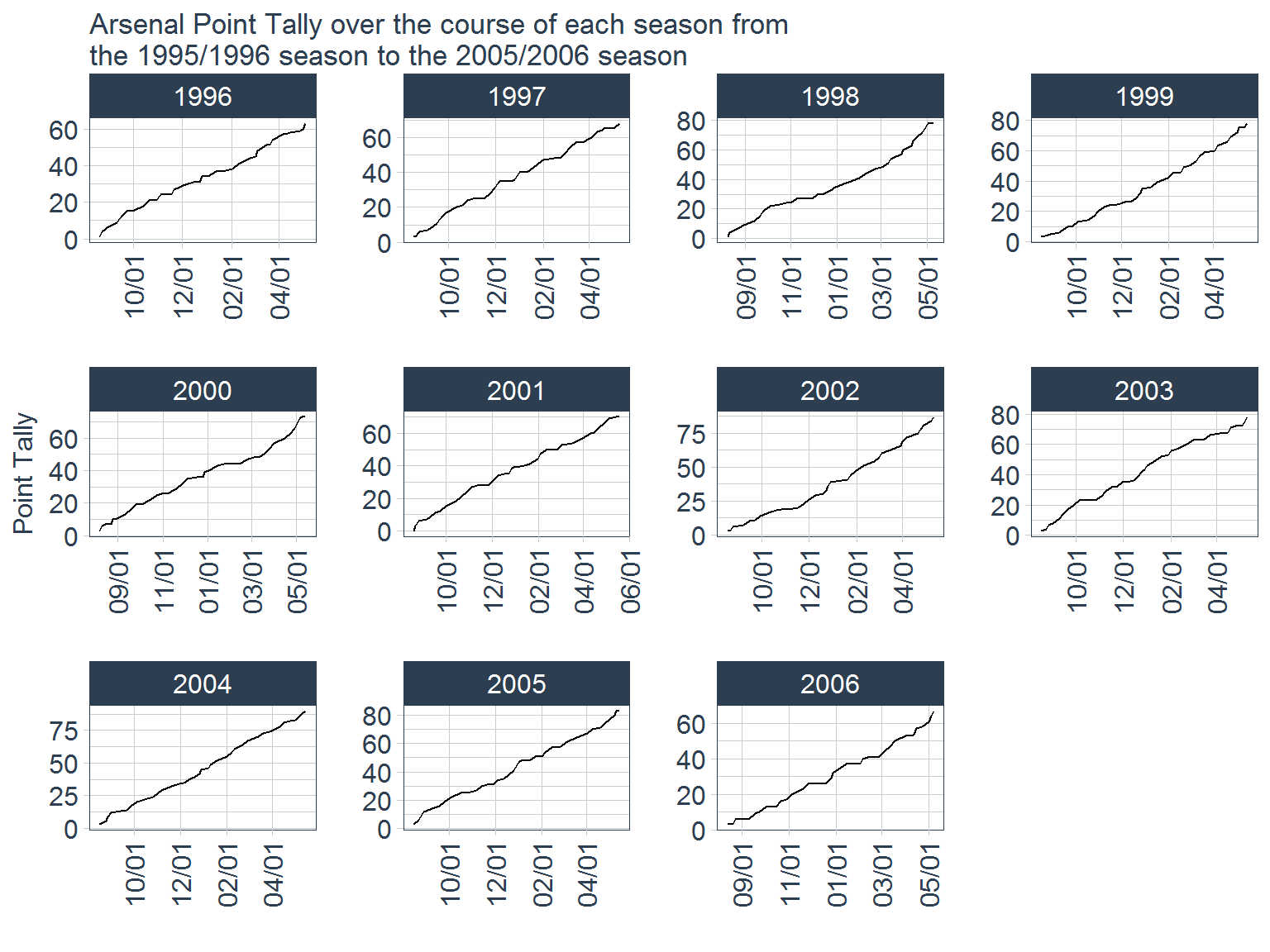
data_tidy %>%
  filter(team == "Arsenal",
         season >= 2007) %>%
  ggplot(aes(Date, points)) +
  facet_wrap(~season, scales = "free") +
  geom_line() +
  theme_tq() +
  scale_x_date(date_breaks = "2 month",
               date_labels = "%m/%d") +
  theme(axis.text.x = element_text(angle = 90, hjust = 1,
                                   vjust = 0.5, size = 12),
        axis.text.y = element_text(size = 12),
        strip.text = element_text(size = 12),
        axis.title = element_text(size = 12))+
  labs(x = "",
       y = "Point Tally",
       title = "Arsenal Point Tally over the course of each season from\nthe 2006/2007 season to the 2016/2017 season")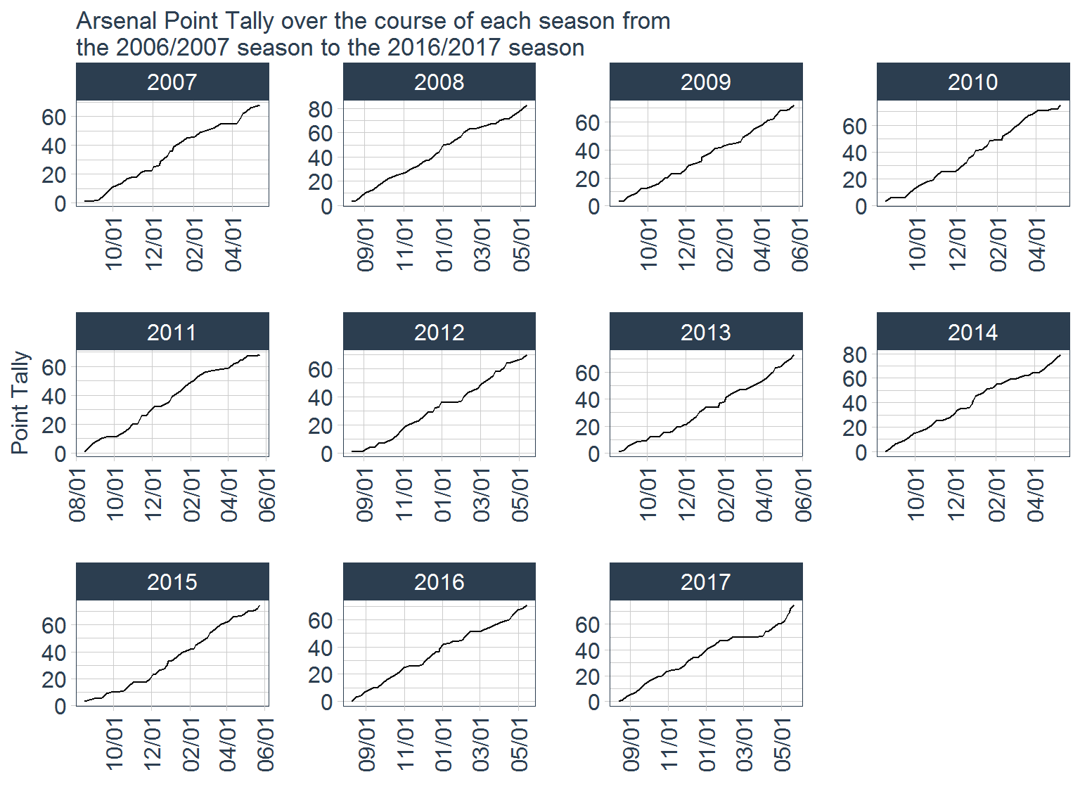
From these graphs, it looks like Arsenal follow a similar pattern every year, which is not surprising since the 2017 season was the first in Arsene Wenger’s tenure that they have not finished in the top 4. Looking at the plot for the 2017 season, it is clear that the period of the season that killed their chances of finishing in the top 4 was the stretch of games between February and March where their point increase flat lined. Let’s now take a look at team’s average finishing point total.
season_ending <- data_tidy %>%
  group_by(season, team) %>%
  summarise(final_points = max(points),
            final_goals_for = sum(FTGF),
            final_goals_against = sum(FTGA),
            final_goal_diff = sum(goal_diff)) %>%
  ungroup() %>%
  group_by(season) %>%
  mutate(table_position = 20 - rank(final_points, ties.method = "min")) %>%
  ungroup()

season_ending
## # A tibble: 440 x 7
## season team final_points final_goals_for final_goals_against
## <dbl> <chr> <dbl> <int> <int>
## 1 1996 Arsenal 63 49 32
## 2 1996 Aston Villa 63 52 35
## 3 1996 Blackburn 61 61 47
## 4 1996 Bolton 29 39 71
## 5 1996 Chelsea 50 46 44
## 6 1996 Coventry 38 42 60
## 7 1996 Everton 61 64 44
## 8 1996 Leeds 43 40 57
## 9 1996 Liverpool 71 70 34
## 10 1996 Man City 38 33 58
## # ... with 430 more rows, and 2 more variables: final_goal_diff <int>,
## # table_position <dbl>From this output, right away we can see that point ties result in the rank function returning a tie. The EPL determines ties first by highest goal difference, and then goals for. Looking at this first example of the tie between Arsenal and Aston Villa, we can see that they both had a +17 overall goal difference but Aston Villa had 3 more goals for, meaning they finished 4th and Arsenal finished 5th. For now, we won’t worry about fixing these ties.
season_ending_stats <- season_ending %>%
  group_by(team) %>%
  summarise(avg_final_points = round(mean(final_points), 0),
            sd_final_points = round(sd(final_points), 0),
            avg_final_goals_for = round(mean(final_goals_for), 0),
            sd_final_goals_for = round(sd(final_goals_for), 0),
            avg_final_goals_against = round(mean(final_goals_against), 0),
            sd_final_goals_against = round(sd(final_goals_against), 0),
            avg_table_position = round(mean(table_position), 0),
            sd_table_poisiton = round(sd(table_position), 0),
            num_seasons = n())

season_ending_stats
## # A tibble: 46 x 10
## team avg_final_points sd_final_points avg_final_goals_for
## <chr> <dbl> <dbl> <dbl>
## 1 Arsenal 75 7 71
## 2 Aston Villa 50 11 46
## 3 Barnsley 35 NaN 37
## 4 Birmingham 43 7 39
## 5 Blackburn 48 10 48
## 6 Blackpool 39 NaN 55
## 7 Bolton 44 9 44
## 8 Bournemouth 44 3 50
## 9 Bradford 31 7 34
## 10 Burnley 34 5 36
## # ... with 36 more rows, and 6 more variables: sd_final_goals_for <dbl>,
## # avg_final_goals_against <dbl>, sd_final_goals_against <dbl>,
## # avg_table_position <dbl>, sd_table_poisiton <dbl>, num_seasons <int>As we can see from the tibble summary, there are several teams that have only been in the premier league for a single year, resulting in NaN values for the standard deviation columns. To avoid cluttering the next graph, we will remove any teams that have not been in the premier league for at least 10 of the 22 seasons being analyzed.
season_ending_stats %>%
  filter(num_seasons >= 10) %>%
  arrange(-avg_final_points) %>%
  mutate(team = factor(team, team)) %>%
  ggplot(aes(team, avg_final_points)) +
  geom_bar(stat = "identity", fill = "red") +
  geom_point(color = "navy") +
  geom_errorbar(aes(ymin = avg_final_points - 2*sd_final_points,
                    ymax = avg_final_points + 2*sd_final_points),
                color = "navy", size = 1) +
  theme_tq() +
  theme(axis.text.x = element_text(angle = 90, hjust = 1,
                                   vjust = 0.5, size = 12),
        axis.text.y = element_text(size = 12),
        axis.title = element_text(size = 12)) +
  labs(x = "Team",
       y = "Final Points",
       title = "Average Final Points from 1995/1996 season to 2016/2017 season",
       subtitle = "Only teams with 10 or more seasons in the EPL were included")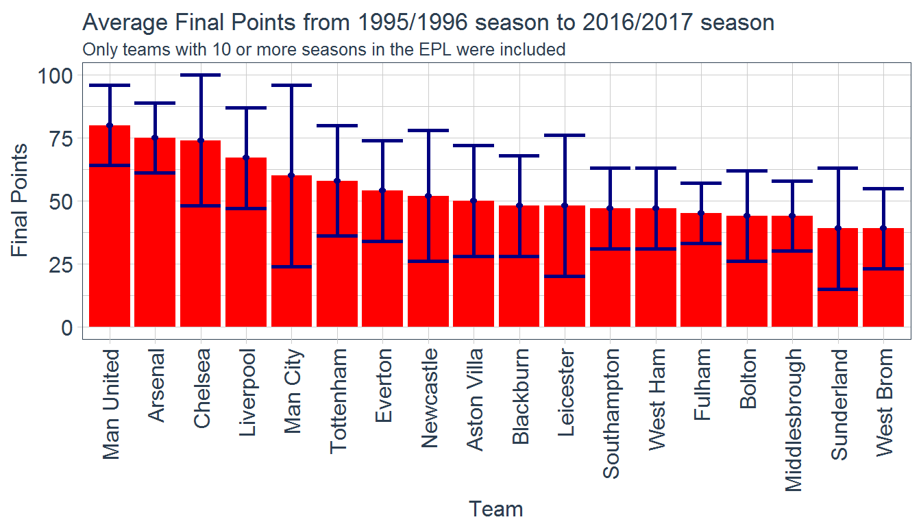
It looks like Manchester United have the highest average final points per season. They are followed closely by Arsenal and Chelsea, who are then closely followed by Liverpool, Manchester City, and Tottenham. It is worth noting that Chelsea and Manchester City both have much higher error associated with their mean value, indicating they have much more fluctuation in the final point tallies. Another interesting take away from this figure is that the lowest average final point tally for teams that have been in the premier league for at least 10 of the previous 22 seasons is 39 points. 39 points typically guarantees a season that is safe from relegation. However, for the teams with the lower average finally point tally, such as Sunderland and West Brom, see the lower tails of their error bars treading dangerously close to relegation zone.
Now, it will be interesting to see how these teams final point tallies will look on the new joyplots from the ggjoy package.
season_ending %>%
  group_by(team) %>%
  mutate(num_seasons = n(),
         avg_final_points = round(mean(final_points), 0)) %>% #add these columns for filtering and factoring respectively
  ungroup() %>%
  filter(num_seasons >= 10) %>%
  arrange(avg_final_points) %>%
  mutate(team = factor(team, unique(team))) %>%
  ggplot(aes(final_points, team)) +
  geom_joy(scale = 0.9, rel_min_height = 0.01,
           fill = "red", color = "black", size = 1) +
  theme_tq()+
  theme(axis.text = element_text(size = 12),
        axis.title = element_text(size = 12)) +
  labs(x = "Final Points",
       y = "Team",
       title = "Joyplot showing EPL teams' individual season final point tally distribution")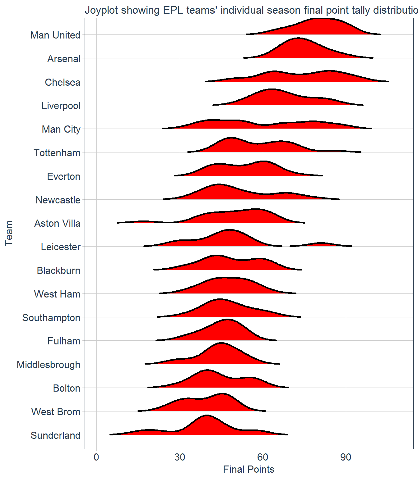
The joyplot confirms the conclusions drawn from the bar chart. Manchester United and Arsenal have the highest final point distribution and both have close to a bell curve. However, Chelsea and Manchester City both have much wider distributions as they have much more ups and downs over the past 22 years.
Looking at opening weekend results
Since this weekend marks the start of the 2017/2018 season, it will be interesting to see how teams have fared over the last 22 seasons. First, we will start by filtering for the first game of the season.
opening_games <- data_tidy %>%
  group_by(season, team) %>%
  mutate(final_points = max(points),
            final_goals_for = sum(FTGF),
            final_goals_against = sum(FTGA),
         game = rank(Date)) %>%
  ungroup() %>%
  group_by(season, game) %>%
  mutate(table_position = 21 - min_rank(final_points)) %>%
  ungroup() %>%
  filter(game == 1) %>%
  group_by(team) %>%
  mutate(final_points_last = lag(final_points),
         final_goals_for_last = lag(final_goals_for),
         final_goals_against_last = lag(final_goals_against),
         final_table_position_last = lag(table_position)) %>%
  ungroup()

opening_games
## # A tibble: 440 x 24
## Div season Date team venue FTR FTGF FTGA HTR HTGF
## <chr> <dbl> <date> <chr> <chr> <chr> <int> <int> <chr> <int>
## 1 E0 1996 1995-08-19 Aston Villa Home W 3 1 W 3
## 2 E0 1996 1995-08-19 Blackburn Home W 1 0 W 1
## 3 E0 1996 1995-08-19 Chelsea Home D 0 0 D 0
## 4 E0 1996 1995-08-19 Liverpool Home W 1 0 D 0
## 5 E0 1996 1995-08-19 Man City Home D 1 1 L 0
## 6 E0 1996 1995-08-19 Newcastle Home W 3 0 W 1
## 7 E0 1996 1995-08-19 Southampton Home L 3 4 L 1
## 8 E0 1996 1995-08-19 West Ham Home L 1 2 W 1
## 9 E0 1996 1995-08-19 Wimbledon Home W 3 2 D 2
## 10 E0 1996 1995-08-19 Man United Away L 1 3 L 0
## # ... with 430 more rows, and 14 more variables: HTGA <int>,
## # goal_diff <int>, points_earned <dbl>, points <dbl>,
## # goal_diff_tot <int>, final_points <dbl>, final_goals_for <int>,
## # final_goals_against <int>, game <dbl>, table_position <dbl>,
## # final_points_last <dbl>, final_goals_for_last <int>,
## # final_goals_against_last <int>, final_table_position_last <dbl>Now that we have a data set with all of the teams opening games results, we can look at some of the factors that could influence opening weekend results. First let’s look at how home field advantage helps teams on opening weekend
opening_home_adv <- opening_games %>%
  group_by(venue) %>%
  summarise(perc_W = round((sum(FTR == "W")/n()) * 100, 1),
            perc_L = round((sum(FTR == "L")/n()) * 100, 1),
            perc_D = round((sum(FTR == "D")/n()) * 100, 1))

opening_home_adv
## # A tibble: 2 x 4
## venue perc_W perc_L perc_D
## <chr> <dbl> <dbl> <dbl>
## 1 Away 30.5 42.3 27.3
## 2 Home 41.8 30.9 27.3It looks like the home teams have better luck on the first weekend of the season than the away team. Let’s look at home this compares with the home field advantage of all games to see if there is any difference for the first week.
home_adv <- data_tidy %>%
  group_by(venue) %>%
  summarise(perc_W = round((sum(FTR == "W")/n()) * 100, 1),
            perc_L = round((sum(FTR == "L")/n()) * 100, 1),
            perc_D = round((sum(FTR == "D")/n()) * 100, 1))

home_adv
## # A tibble: 2 x 4
## venue perc_W perc_L perc_D
## <chr> <dbl> <dbl> <dbl>
## 1 Away 27.5 46.5 26
## 2 Home 46.5 27.5 26It looks like the away team actually fairs slightly better on opening weekend than during the rest of the season. Let’s now take a look at the winning percentage by year for the home teams and the away teams.
opening_games %>%
  group_by(season, venue) %>%
  summarise(perc_W = round((sum(FTR == "W")/n()) * 100, 1),
            perc_L = round((sum(FTR == "L")/n()) * 100, 1),
            perc_D = round((sum(FTR == "D")/n()) * 100, 1)) %>%
  gather(key = "result", value = "percentage", perc_W:perc_D) %>%
  mutate(result = case_when(result == "perc_W" ~ "Winning Percentage",
                            result == "perc_L" ~ "Losing Percentage",
                            TRUE ~ "Percent Draws")) %>%
  filter(venue == "Home") %>%
  ggplot(aes(season, percentage, color = result)) +
  geom_point() +
  geom_line(size = 1) +
  theme_tq() +
  scale_color_tq() +
  theme(axis.text.x = element_text(angle = 90,
                                   vjust = 0.5,
                                   hjust = 1,
                                   size = 12),
        axis.text.y = element_text(size = 12),
        legend.title = element_blank()) +
  labs(x = "Year",
       y = "Percentage of Results by Year",
       title = "The Percent of Results (Win, Draw, Loss) per Season\nfor Home Teams on Opening Weekend")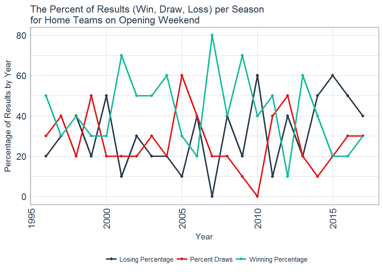
It looks like the winning percentage for home teams fluctuates and there is no clear trend as to whether being home on opening weekend provides any benefit. Since 2014, the home teams have a higher losing percentage than winning percentage. Perhaps, in recent years, there has been some shift that has made playing away from home more desirable on opening weekend. Likely this is just random, however, and there is no overall benefit to being home or away. While there does not appear to be any overall inferences that can be made from playing home or away on opening weekend, looking at the winning percentage for home and away opening games for the individual teams may provide some interesting results.
home_adv_team <- opening_games %>%
  group_by(team) %>%
  #removing teams that have not played at least ten seasons in the premier league
  mutate(num_seasons = n()) %>%
  filter(num_seasons >= 10) %>%
  select(-num_seasons) %>%
  ungroup() %>%
  group_by(team, venue) %>%
  summarise(winning_percentage = round((sum(FTR == "W")/n()) * 100, 0),
            num_games_total = n()) %>%
  ungroup()

home_adv_team
## # A tibble: 36 x 4
## team venue winning_percentage num_games_total
## <chr> <chr> <dbl> <int>
## 1 Arsenal Away 43 7
## 2 Arsenal Home 60 15
## 3 Aston Villa Away 31 13
## 4 Aston Villa Home 50 8
## 5 Blackburn Away 40 5
## 6 Blackburn Home 40 10
## 7 Bolton Away 43 7
## 8 Bolton Home 50 6
## 9 Chelsea Away 56 9
## 10 Chelsea Home 77 13
## # ... with 26 more rowshome_adv_team %>%
arrange(-winning_percentage) %>%
mutate(team = factor(team, unique(team)),
venue = factor(venue, levels = c("Home", "Away"))) %>%
ggplot(aes(team, winning_percentage, fill = venue)) +
facet_wrap(~venue, scales = "fixed", ncol = 1) +
geom_bar(stat = "identity") +
theme_tq() +
scale_fill_tq() +
theme(axis.text.x = element_text(angle = 90, hjust = 1, vjust = 0.5, size = 12),
axis.text.y = element_text(size = 12),
strip.text = element_text(size = 12),
legend.position = "none") +
geom_text(aes(x = team, y = winning_percentage + 5, label = paste0("n=", as.character(num_games_total)))) +
labs(x = "",
y = "Winning Percentage",
title = "Winning Percentage for Teams on Opening Weekend both Home and Away",
subtitle = "Only teams with more than 10 seasons in the premier league were included")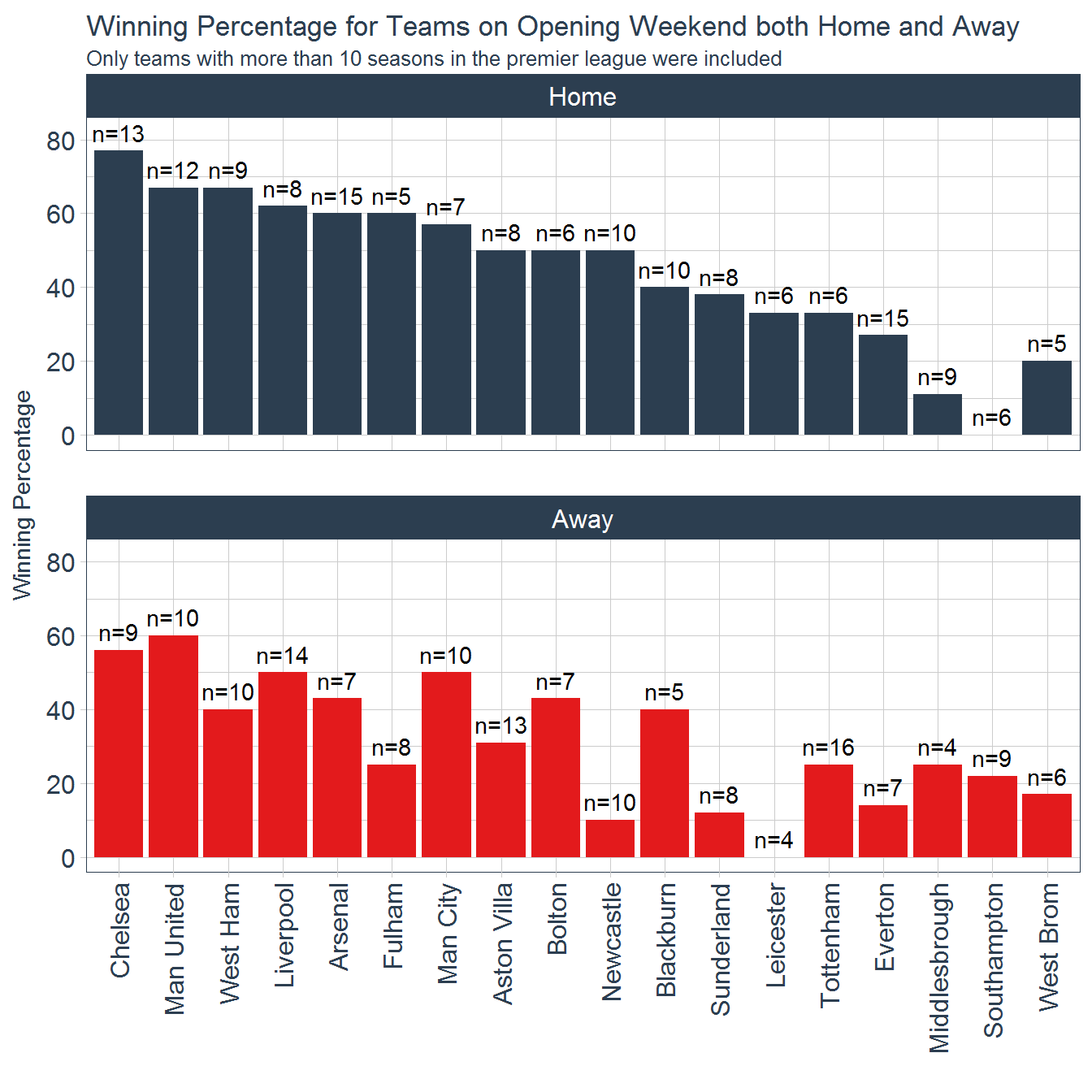
This figure seems to provide much more insight into how home field advantage can impact teams. For example, Arsenal have a 60% winning percentage at home on opening weekend, and their opponent this weekend, Leicester City, have not won a opening game away from home in the premier league since 1996. This is a very positive sign for the gunners as their match is being played at the Emirates Stadium (Arsenal’s Home Field). Chelsea have a winning percentage in the high 70s when they play their opening game at home, as they do this year. That fact seems promising (unfortunately) for the blues, as their opening match this year is at home. Other noticeable impacts of home field advantage are New Castle United and Sunderland. New Castle have a home winning percentage of 50% on opening weekend, but only have a 10% winning percentage for away games on opening weekend. Fortunately for them, they are also playing at home this year. Unfortunately for them, they are matched up with West Ham who don’t have much issue playing on the road opening weekend, with a 40% winning percentage when away from home. Sunderland, similarly has an average home winning percentage of just under 40% for opening weekend, but have a winning percentage of only just north of 10% when playing away from home. However, Sunderland were relegated last season, so maybe they will have better luck in the Championship. Several teams seem not to be impacted by whether or not they play at home on opening weekend. Manchester United and Manchester City both only see a slight dip in winning percentage when away from home, and Blackburn has a 40% winning percentage when both home and away on opening weekend.
Let’s take a look at each team’s overall winning percentage on opening weekend.
opening_games %>%
  group_by(team) %>%
  #removing teams that have not played at least ten seasons in the premier league
  mutate(num_seasons = n()) %>%
  filter(num_seasons >= 10) %>%
  select(-num_seasons) %>%
  ungroup() %>%
  group_by(team) %>%
  summarise(winning_percentage = round((sum(FTR == "W")/n()) * 100, 0),
            num_games_total = n()) %>%
  ungroup() %>%
  arrange(-winning_percentage) %>%
  mutate(team = factor(team, unique(team))) %>%
  ggplot(aes(team, winning_percentage)) +
  geom_bar(stat = "identity", fill = "red", color = "black") +
  theme_tq() +
  theme(axis.text.x = element_text(angle = 90, hjust = 1, vjust = 0.5, size = 12),
        axis.text.y = element_text(size = 12),
        strip.text = element_text(size = 12),
        legend.position = "none") +
  geom_text(aes(x = team, y = winning_percentage + 5, label = paste0("n=", as.character(num_games_total)))) +
  labs(x = "",
       y = "Winning Percentage",
       title = "Winning Percentage for Teams on Opening Weekend",
       subtitle = "Only teams with more than 10 seasons in the premier league were included")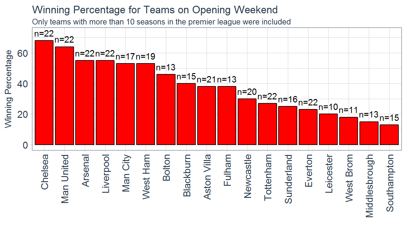
It looks like the results follow a similar pattern to the previous figure, as expected. Chelsea and Manchester United have the best winning percentages (>60%) on opening weekend, with Arsenal, Liverpool, Manchester City, and West Ham all close behind in the 50% range.
Conclusions
It looks like the odds are in favor of several of the typical powerhouse teams to perform well this weekend, if history has anything to say about it. There is much more that can be done with this data set and I hope to revisit it at a later date. I hope you all enjoyed reading this, I hope to put out more blog posts in the future!
And of course, COYG!!