Introduction
The other day, a question was posted on RStudio Community about performing Principal Component Analysis (PCA) in a tidyverse workflow. Conveniently, I had literally just worked through this process the day before and was able to post an answer. While most questions and answers are good as they are on forum sites, I thought this one might be worth exploring a little more since using the tidyverse framework makes PCA much easier, in my opinion.
PCA is a multi-variate statistical technique for dimension reduction. Essentially, it allows you to take a data set that has n continuous variables and relate them through n orthogonal dimensions. This is a method of unsupervised learning that allows you to better understand the variability in the data set and how different variables are related. While there are the same number of principal components created as there are variables (assuming you have more observations than variables-but that is another issue), each principal component explains the maximum possible variation in the data conditional on it being orthogonal, or perpendicular, to the previous principal components.
In my answer, I used the iris data set to demonstrate how PCA can be done in the tidyverse workflow. For this post, I will be using the USArrests data set that was used in An Introduction to Statistical Thinking by Gareth James et. al. In this book, they work through a PCA and focus on the statistics and explanations behind PCA. This is how I learned how to do PCA and would highly recommend it if you are unfamiliar with the topic. In this blog post, my focus will be more on implementing the PCA in the tidyverse framework. Another nice walkthough of PCA with this dataset that is online can be found at University of Cincinnati’s R blog.
Exploring the data
Before we dive in to the analysis, we want to explore our data set and become familiar with it.
library(tidyverse)
library(broom)
library(knitr)
library(ggfortify)
USArrests %>% head() %>% knitr::kable()| Murder | Assault | UrbanPop | Rape | |
|---|---|---|---|---|
| Alabama | 13.2 | 236 | 58 | 21.2 |
| Alaska | 10.0 | 263 | 48 | 44.5 |
| Arizona | 8.1 | 294 | 80 | 31.0 |
| Arkansas | 8.8 | 190 | 50 | 19.5 |
| California | 9.0 | 276 | 91 | 40.6 |
| Colorado | 7.9 | 204 | 78 | 38.7 |
Looking at the first 6 rows using the head() function, we can see that each row is a state and and each column is a variable. Looking at ?USArrests, we can see that the column descriptions are as follows:
- Murder - the number of murder arrests per 100,000 people in a given state
- Assault - the number of assault arrests per 100,000 people in a given state
- UrbanPop - a numeric percentage of the urban population per state (i.e. the percentage of the state’s population that lives in cities)
- Rape - the number of rape arrests per 100,000 people in a given state
Now, that we see how the data set is set up, let’s try to visualize the data as it is. Before we do that, let’s convert the data set to a tibble. Since tibbles do not support rownames, we will have to convert them to their own column with rownames_to_column.
us_arrests <- USArrests %>%
  rownames_to_column(var = "state") %>%
  # I prefer column names to be all lowercase so I am going to change them here
  rename_all(tolower) %>%
  as_tibble()

us_arrests
## # A tibble: 50 x 5
## state murder assault urbanpop rape
## <chr> <dbl> <int> <int> <dbl>
## 1 Alabama 13.2 236 58 21.2
## 2 Alaska 10.0 263 48 44.5
## 3 Arizona 8.10 294 80 31.0
## 4 Arkansas 8.80 190 50 19.5
## 5 California 9.00 276 91 40.6
## 6 Colorado 7.90 204 78 38.7
## 7 Connecticut 3.30 110 77 11.1
## 8 Delaware 5.90 238 72 15.8
## 9 Florida 15.4 335 80 31.9
## 10 Georgia 17.4 211 60 25.8
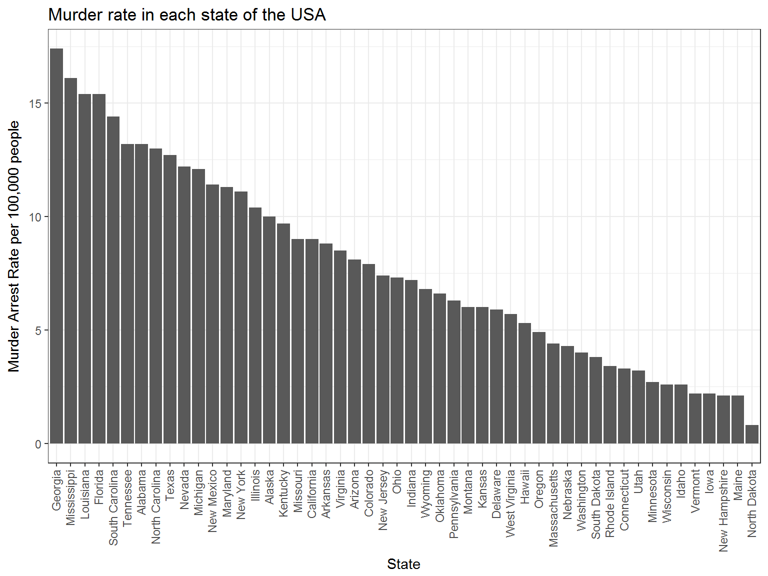
## # ... with 40 more rowsLet’s take a look at murder arrest rates in each of the stats.
us_arrests %>%
  mutate(state = factor(state),
         state = fct_reorder(state, murder) %>% fct_rev()) %>%
  ggplot(aes(state, murder)) +
  geom_bar(stat = "identity") +
  theme_bw() +
  theme(axis.text.x = element_text(angle = 90, hjust = 1, vjust = 0.4)) +
  labs(y = "Murder Arrest Rate per 100,000 people",
       x = "State",
       title = "Murder rate in each state of the USA")
You can see that Georgia has the highest murder rate, followed by Mississippi, Louisiana, and Florida Let’s try one more.
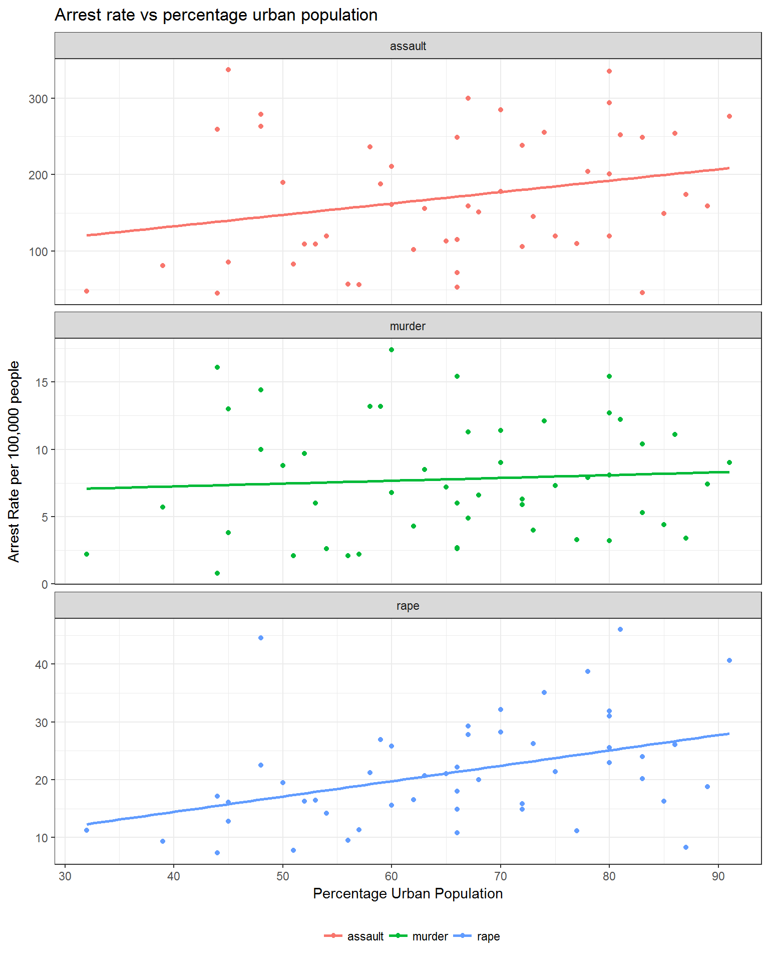
us_arrests %>%
  gather(key = crime, value = rate, c(murder, assault, rape)) %>%
  ggplot(aes(urbanpop, rate, color = crime)) +
  facet_wrap(~crime, scales = "free_y", ncol = 1) +
  geom_point() +
  geom_smooth(se = FALSE, method = "lm") +
  theme_bw() +
  labs(x = "Percentage Urban Population",
       y = "Arrest Rate per 100,000 people",
       title = "Arrest rate vs percentage urban population") +
  theme(legend.title = element_blank(),
        legend.position = "bottom")
This figure is a slightly more informative than the last one. In this figure, each crime rate is plotted against percentage urban population. Simple linear models are fit for each of the different crime types to see if any pattern can be seen in the data. There appears to be an increase in assault arrests as urban population grows, however, there is a lot of variability around the line of best fit. Rape arrest rates follow the linear model much closer than the others but there is still a lot of variability. On the other hand, murder arrest rates seem to be unchanged based on urban population.
Now we could certainly do correlations, multiple linear regressions, or fit other types of models and would likely gain some useful insights, but instead let’s focus on the PCA.
PCA in the tidyverse framework
Now, when I first fit PCA models in R, I found myself with an unmanageable number of variables and to track and maintain. This can make the process overwhelming and can make you lose track of information. Luckily, using the tidyverse and the broom package, we can solve these issues much more easily. In order to run the model in the tidyverse framework, we will use the nest() function along with the mutate and map combo to operate on the nested columns.
us_arrests_pca <- us_arrests %>%
  nest() %>%
  mutate(pca = map(data, ~ prcomp(.x %>% select(-state),
                                  center = TRUE, scale = TRUE)),
         pca_aug = map2(pca, data, ~augment(.x, data = .y)))

us_arrests_pca
## # A tibble: 1 x 3
## data pca pca_aug
## <list> <list> <list>
## 1 <tibble [50 x 5]> <S3: prcomp> <data.frame [50 x 10]>As you can see, we now have a tibble with one row and three columns. The first is our original data set, the second is the prcomp object and the third is a data frame containing the principal component values for each observation. Now we have everything we need to evaluate the results of the model. First, it is important to look at how much variance is explained by each principal component. This will tell you how many of the components you need to look at when analyzing the results. To do this, you can use the data in the pca_aug column of our us_arrests_pca tibble along with some dplyr functions.
var_exp <- us_arrests_pca %>%
  unnest(pca_aug) %>%
  summarize_at(.vars = vars(contains("PC")), .funs = funs(var)) %>%
  gather(key = pc, value = variance) %>%
  mutate(var_exp = variance/sum(variance),
         cum_var_exp = cumsum(var_exp),
         pc = str_replace(pc, ".fitted", ""))

var_exp
## # A tibble: 4 x 4
## pc variance var_exp cum_var_exp
## <chr> <dbl> <dbl> <dbl>
## 1 PC1 2.48 0.620 0.620
## 2 PC2 0.990 0.247 0.868
## 3 PC3 0.357 0.0891 0.957
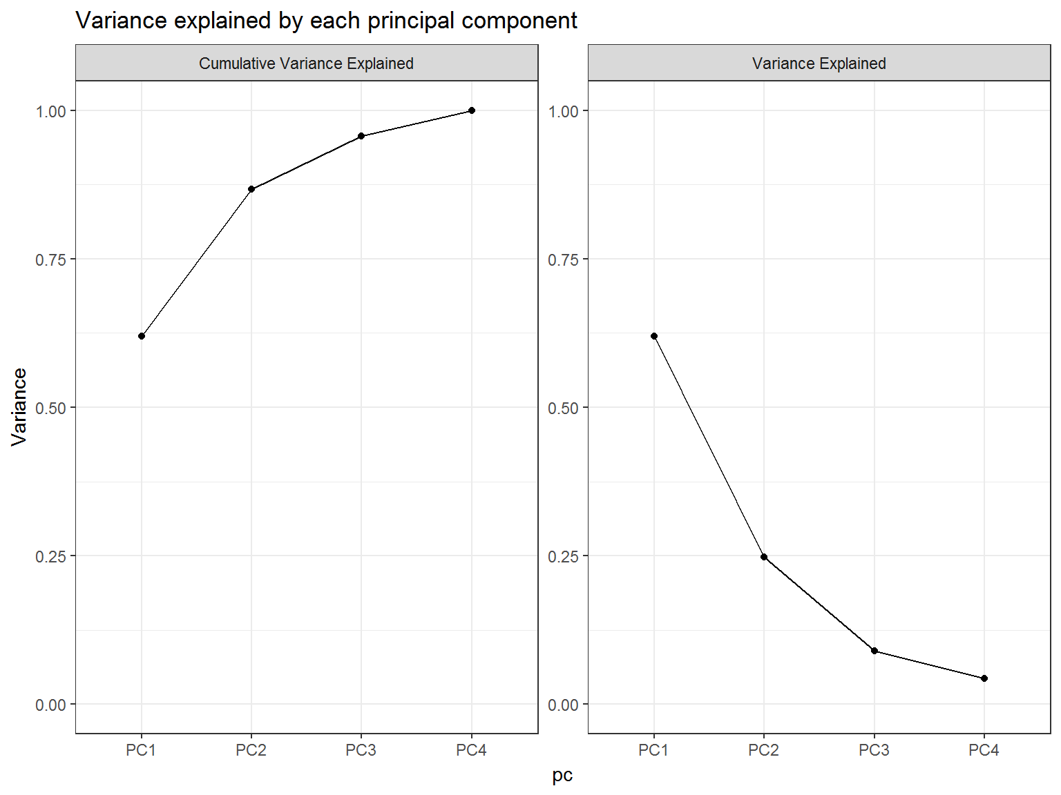
## 4 PC4 0.173 0.0434 1.00We can see that the first principal component explains 62% of the variation and that the second principal component explains 25% of the remaining variation. Together, we can see that they explain 87% of the variance in the data set. As a general rule of thumb, you want to look at enough principal components to explain ~90% of your data’s variability.
Another way of assessing this is to plot the variance explained and the cumulative variance explained and look for the “elbow” in the graph. You can do that like this:
var_exp %>%
  rename(
    `Variance Explained` = var_exp,
    `Cumulative Variance Explained` = cum_var_exp
  ) %>%
  gather(key = key, value = value, `Variance Explained`:`Cumulative Variance Explained`) %>%
  ggplot(aes(pc, value, group = key)) +
  geom_point() +
  geom_line() +
  facet_wrap(~key, scales = "free_y") +
  theme_bw() +
  lims(y = c(0, 1)) +
  labs(y = "Variance",
       title = "Variance explained by each principal component")
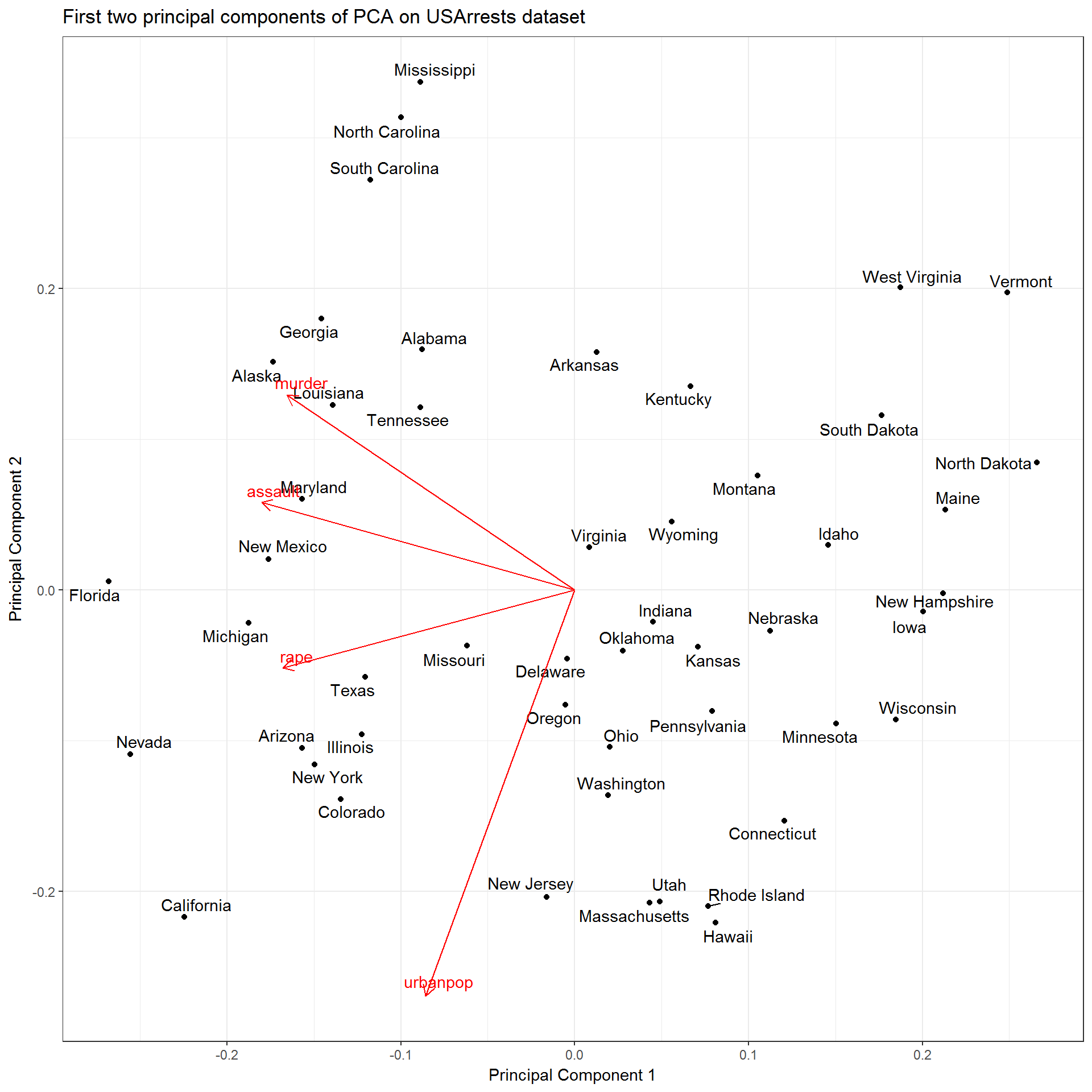
Since the majority of the variance is explained by the first two principal components, let’s plot them against each other. Luckily, this is made easy by the ggplot2 and ggfortify packages which gives an autoplot method for prcomp objects. Conveniently, we still have our prcomp object stored in the our us_arrests_pca tibble along with our original data. This is important as the original data is needed to add labels and/or colors to your ggplot based on discrete variables not included in the PCA. Using the same mutate and map combo as before, along with the handy dplyr::pull function, we can plot this graph. autoplot.prcomp() can take any arguments that can be passed to ggbiplot(), so to see all of your options use ?ggbiplot.
us_arrests_pca %>%
  mutate(
    pca_graph = map2(
      .x = pca,
      .y = data,
      ~ autoplot(.x, loadings = TRUE, loadings.label = TRUE,
                 loadings.label.repel = TRUE,
                 data = .y, label = TRUE,
                 label.label = "state",
                 label.repel = TRUE) +
        theme_bw() +
        labs(x = "Principal Component 1",
             y = "Principal Component 2",
             title = "First two principal components of PCA on USArrests dataset")
    )
  ) %>%
  pull(pca_graph)
## [[1]]
If you notice the [[1]] above the graph, this method would automatically print each graph in the pca_graph column. This means that if you fit multiple pca graphs onto a grouped data set then this would automatically print all of the figures for you in one command. Another important thing to notice is the the autoplot() function simply returns a gg object and that can be extended just like any other ggplot.
Looking at this figure, we are getting a lot more information about how these variables are related. For example, we can see that murder, rape, and assault arrest rates all have similar values alone the first principal component, which indicates that they are correlated with one another. We may have been able to figure that out using more basic methods, but this method allows us to see it in one figure. In addition, we are able to see how each of the observations in the data (i.e. states) relates to the variables. For example, California is characterized by high arrest rates (1st principal component) and high urban population (2nd principal component).
Conclusion
PCA can provide an analysis with a lot of information about their data set and can give valuable insights into potentially unseen relationships between the observations and the variables. By performing this analysis in the tidyverse framework, we can easily extend this model by using the modelling capabilities of the tidyverse. You can see some of these here and here. I believe that this framework allows for much more flexibility in your analysis and how you use the data from the model, which will enable you to gather more from your data in a faster and convenient way.
Please let me know what you think of performing PCA in the tidyverse framework!