Introduction
purrr is an incredibly powerful package that has greatly enhanced my R programming abilities. purrr has applications in pretty much any situation. One of the most useful situations, IMHO, is in the creation of a dynamic number of shiny UI elements. This can be extremely useful if you want to be able to create a dynamic number of ui elements (whether that be inputs or outputs) based on either user selection or the data being used. This post will walk through how to create a dynamic number of plots depending on how many parameters the user selects.
Background
Before we get started, let’s load the libraries we will be using.
library(dataRetrieval)
library(tidyverse)
library(lubridate)
library(shiny)
library(shinyjs)
library(plotly)
Data
In this post, I will be using the R package dataRetrieval provided by the USGS to access their public API. If you wish to know more about how to use this package I would recommend checking out the package’s vignette. The data used in this example app is daily water quality averages for three parameters (Temperature, Conductivity, and Dissolved Oxygen) measured in the Delaware River at the Ben Franklin Bridge in Philadelphia, PA. The code to pull the site info is placed at the top of the script outside of the ui and server code and looks like this:
# usgs site number of ben franklin bridge site
site <- "01467200"

site_info <- whatNWISdata(siteNumbers = site, service = "dv", statCd = "00003")

param_info <- site_info$parm_cd %>% unique() %>% readNWISpCode()


site_meta <- site_info %>%
  select(site_no, station_nm, parm_cd) %>%
  left_join(param_info %>%
              select(parameter_cd, srsname, parameter_units),
            by = c("parm_cd" = "parameter_cd")) %>%
  # these are the parameters with data at this site
  filter(parm_cd %in% c("00010", "00095", "00300"))

param_choices <- site_meta$parm_cd
names(param_choices) <- site_meta$srsname
The actual data is queried from the API using the readNWISdv function and reformatted to be easy to graph inside an eventReactive function at the top of the server code. This looks like this:
wq_data <- eventReactive(input$submit, {
      req(input$parameter, input$date)

      raw_data <- readNWISdv(
        siteNumbers = site,
        parameterCd = input$parameter,
        startDate = input$date[[1]],
        endDate = input$date[[2]]
      )

      output <- raw_data %>%
        select(-contains("_cd")) %>%
        gather(key = "parameter", value = "result", contains("X_")) %>%
        mutate(parameter = str_replace_all(parameter, "X_|_00003", "")) %>%
        left_join(site_meta, by = c("parameter" = "parm_cd", "site_no"))

      return(output)
    })
Plotting function
Since the focus of this post is how to generate multiple plots and the data format after basic manipulation is the same for all three parameters, I have defined my plot generation as a function named wq_plotly() outside of the server code. This functions looks like this:
wq_plotly <- function(data){
  data %>%
    plot_ly(
      x = ~Date,
      y = ~result,
      type = "scatter",
      mode = "lines+markers",
      marker = list(
        size = 4,
        color = "blue"
      ),
      line = list(
        color = "blue"
      ),
      hoverinfo = "text",
      text = ~paste(
        "Site:", station_nm,
        "<br>Parameter:", srsname,
        "<br>Date Time:", format(Date),
        "<br>Result:", result,
        "<br>Units:", parameter_units
      )
    ) %>%
    layout(
      title = paste(
        unique(data$station_nm), "<br>",
        unique(data$srsname),
        paste0("(", unique(data$parameter_units), ")")
      ),
      titlefont = list(
        size = 10
      ),
      xaxis = list(
        title = ""
      ),
      yaxis = list(
        title = ""
      ),
      margin = list(
        t = 40
      )
    )
}
UI
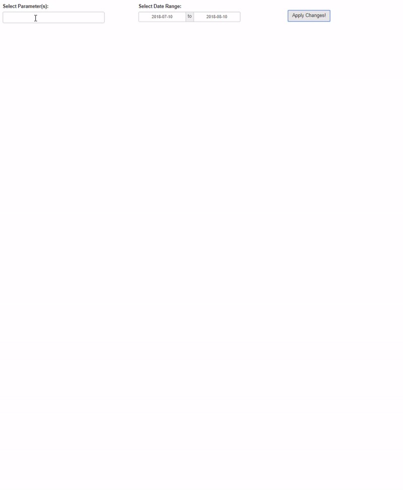
So the first part of the app is the ui code. This part is actually somewhat straightforward because all of the magic is gonna happen in our server code. We have to define our inputs for which parameters to graph (named input$parameter) and the desired date range (named input$date) and create an actionButton so that the user controls when new graphs are generated (my personal preference). I create these all within a single fluidRow with each in its own column.
After that, I create a new fluidRow and simply have a uiOutput (with an id of graphs_ui) in it. This uiOutput will be created in our server code and contain all of the ui elements for our plots.
Here is the full ui code:
ui <- shinyUI(
  fluidPage(
    tags$head(
      tags$style(HTML('.shiny-input-container{margin-top: 20px;}'))
    ),
    div(
      fluidRow(
        column(
          4,
          selectInput(
            inputId = "parameter",
            label = "Select Parameter(s):",
            choices = param_choices,
            multiple = TRUE
          )
        ),
        column(
          4,
          dateRangeInput(
            inputId = "date",
            label = "Select Date Range:",
            start = Sys.Date() - days(31),
            end = Sys.Date()
          )
        ),
        column(
          4,
          actionButton(
            inputId = "submit",
            label = "Apply Changes!",
            style = "margin:40px;"
          )
        )
      ),
      fluidRow(
        div(
          id = "plot-container",
          uiOutput(
            outputId = "graphs_ui"
          )
        )
      )
    )
  )
)
Server
Now for the fun! The first part of the server code, which was shown above, is the wq_data reactive expression to query our data set. The next part involves generating a reactive object that contains a list of our graphs (a vector would work too). This is important because it is what will be used to generate the different inputs. Since I defined my graphing function above, I can call that with a combination of dplyr::group_by, tidyr::nest, dplyr::mutate, purrr::map, and dplyr::pull. This combination allows us to create unique graphs for each parameter and store them in a single list. The code looks like this:
graphs <- eventReactive(input$submit, {
  req(wq_data())

  wq_data() %>%
    group_by(parameter) %>%
    nest() %>%
    mutate(
       graphs = map(data, wq_plotly)
    ) %>%
    arrange(parameter) %>%
    pull(graphs)
})
It is important to note that I have only tested this on plotly, ggplot2, and base graphics. This method only works with plotly and ggplot2. It does not work with base graphics because base plots cannot be saved as objects.
Now that we have our list of graphs, we need to create our outputs. However, since we are giving the user the ability to choose how many parameters they want to create graphs for, how do we know how many outputs to create? With purrr and our list of graphs, we don’t need to know how many outputs need to be created. By iterating over our list of graphs with iwalk we can create as many outputs as there are graphs.
In this case, we want to use purrr::iwalk (which is a variant of walk) because we want to use both the graph and its index. Using iwalk(x, ...) is the same as using walk2(x, seq_along(x), ...). We use walk instead of map because we are not returning anything from the overall iteration, but rather only using it for its side effects. Using walk instead of map is similar to using an observe function instead of a reactive function. To further connect the comparison, we will use our iwalk function inside of an observeEvent function.
Here is what the output generation looks like:
observeEvent(input$submit, {
  req(graphs())

  iwalk(graphs(), ~{
    output_name <- paste0("plot_", .y)
    output[[output_name]] <- renderPlotly(.x)
  })
})
There are two simple pieces to our iwalk function. First, we define a unique outputId using the index of the plot in our list. Then using that outputId we can render our plotly object.
Note: defining an output using output[["my_output_id"]] is the same as defining it as output$my_output_id.
Finally, the last step of the server code is to create the ui elements! Remember, in our ui code, we defined the uiOutput for our graphs with an id of graphs_ui. So now, we will use renderUI and purrr::imap to create our ui elements. Since render* functions are similar to reactive functions, in that they return their output, we use imap rather than iwalk.
Here is what our ui generation looks like:
output$graphs_ui <- renderUI({
  req(graphs())

  plots_list <- imap(graphs(), ~{
    tagList(
      plotlyOutput(
        outputId = paste0("plot_", .y)
      ),
      br()
    )

  })

  tagList(plots_list)
})
As you can see, we use the index of our plot list again to call each individual plot outputId. It is important to notice the tagList(plots_list) call at the end of the renderUI function. Since the output of imap is a list, plots_list is a list of ui elements and is not valid to be entered directly into the UI code. tagList takes care of this for us and combines multiple ui elements into one.
Combining all of these elements, our final shiny app looks like this:
Conclusion
Being able to create a dynamic number of ui elements, whether they are inputs or outputs, is an incredibly powerful tool when trying to scale your shiny apps! The method shown here was applied to creating a dynamic number of graphs based on the users input, but it is certainly not limited to that! You can see an example of how to apply this to creating textInput and numericInput dynamically based on column names of an uploaded dataset in this RStudio Community thread. Learning and using purrr can dramatically increase your capabilities within general R programming and building shiny applications!
Finally, the full code for the shiny app looks like this:
library(dataRetrieval)
library(tidyverse)
library(lubridate)
library(shiny)
library(shinyjs)
library(plotly)


# usgs site number of ben franklin bridge site
site <- "01467200"

site_info <- whatNWISdata(siteNumbers = site, service = "dv", statCd = "00003")

param_info <- site_info$parm_cd %>% unique() %>% readNWISpCode()


site_meta <- site_info %>%
  select(site_no, station_nm, parm_cd) %>%
  left_join(param_info %>%
              select(parameter_cd, srsname, parameter_units),
            by = c("parm_cd" = "parameter_cd")) %>%
  filter(parm_cd %in% c("00010", "00095", "00300"))

param_choices <- site_meta$parm_cd
names(param_choices) <- site_meta$srsname

wq_plotly <- function(data){
  data %>%
    plot_ly(
      x = ~Date,
      y = ~result,
      type = "scatter",
      mode = "lines+markers",
      marker = list(
        size = 4,
        color = "blue"
      ),
      line = list(
        color = "blue"
      ),
      hoverinfo = "text",
      text = ~paste(
        "Site:", station_nm,
        "<br>Parameter:", srsname,
        "<br>Date Time:", format(Date),
        "<br>Result:", result,
        "<br>Units:", parameter_units
      )
    ) %>%
    layout(
      title = paste(
        unique(data$station_nm), "<br>",
        unique(data$srsname),
        paste0("(", unique(data$parameter_units), ")")
      ),
      titlefont = list(
        size = 10
      ),
      xaxis = list(
        title = ""
      ),
      yaxis = list(
        title = ""
      ),
      margin = list(
        t = 40
      )
    )
}


ui <- shinyUI(
  fluidPage(
    tags$head(
      tags$style(HTML('.shiny-input-container{margin-top: 20px;}'))
    ),
    div(
      fluidRow(
        column(
          4,
          selectInput(
            inputId = "parameter",
            label = "Select Parameter(s):",
            choices = param_choices,
            multiple = TRUE
          )
        ),
        column(
          4,
          dateRangeInput(
            inputId = "date",
            label = "Select Date Range:",
            start = Sys.Date() - days(31),
            end = Sys.Date()
          )
        ),
        column(
          4,
          actionButton(
            inputId = "submit",
            label = "Apply Changes!",
            style = "margin:40px;"
          )
        )
      ),
      fluidRow(
        div(
          id = "plot-container",
          uiOutput(
            outputId = "graphs_ui"
          )
        )
      )
    )
  )
)


server <- shinyServer(
  function(input, output, session){
    session$onSessionEnded(stopApp)

    # query data from USGS API
    wq_data <- eventReactive(input$submit, {
      req(input$parameter, input$date)

      raw_data <- readNWISdv(
        siteNumbers = site,
        parameterCd = input$parameter,
        startDate = input$date[[1]],
        endDate = input$date[[2]]
      )

      output <- raw_data %>%
        select(-contains("_cd")) %>%
        gather(key = "parameter", value = "result", contains("X_")) %>%
        mutate(parameter = str_replace_all(parameter, "X_|_00003", "")) %>%
        left_join(site_meta, by = c("parameter" = "parm_cd", "site_no"))

      return(output)
    })

    # create a list of graphs - with one for each parameter selected
    graphs <- eventReactive(input$submit, {
      req(wq_data())

      wq_data() %>%
        group_by(parameter) %>%
        nest() %>%
        mutate(
          graphs = map(data, wq_plotly)
        ) %>%
        arrange(parameter) %>%
        pull(graphs)
    })

    # use purrr::iwalk to create a dynamic number of outputs
    observeEvent(input$submit, {
      req(graphs())

      iwalk(graphs(), ~{
        output_name <- paste0("plot_", .y)
        output[[output_name]] <- renderPlotly(.x)
      })
    })

    # use renderUI to create a dynamic number of output ui elements
    output$graphs_ui <- renderUI({
      req(graphs())

      plots_list <- imap(graphs(), ~{
        tagList(
          plotlyOutput(
            outputId = paste0("plot_", .y)
          ),
          br()
        )

      })

      tagList(plots_list)
    })

  }
)


shinyApp(ui = ui, server = server)