Introduction
Recently, I switched themes for my blog to the blackburn theme and I love it! Luckily, the blogdown package makes this super easy to do within R! If you haven’t used blogdown, I highly recommend you take a look at it for setting up your blog. One of the nice features of the blackburn theme, is that it provides easy to add “social” tags that can be configured in your config.toml file. The built in social tags all come with nice font-awesome icons to their left.
However, one of the social media sites that I visit the most is not included on the provided sites, and that is RStudio Community! RStudio Community is a web-forum that is hosted by RStudio to provide community Q and A for all things related to R, RStudio products, and packages provided by RStudio. If you haven’t been there before, I highly recommend that you check it out! Since this site is not included in blackburn’s social links, I had to add it myself. This post will walk through how to edit the blackburn theme to include custom social links, specifically for RStudio Community.
This post assumes that you have already successfully set up your blog using the blackburn theme. If not, you should check out a few of these links:
Creating the icon
As mentioned above, all of the icons included next to the default social links are added via font-awesome. Unfortunately, neither RStudio or RStudio Community have a font awesome icon, as of this writing. So before we add the link to our social list, we will have to create our own icon (or in this case, simply an image) for this item. This can be done with a little help from the magick package.
The image we are going to use is the same one used as the favicon when you open RStudio Community. If you don’t know what a favicon is, it is simply the image that you see on the left hand side of a browser tab. To get this image, we can use the image_read function. Before we do that, let’s load the packages that
library(magrittr)
library(magick)
To load the image we can use the following command
community_icon_orig <- image_read("https://www.rstudio.com/wp-content/uploads/2018/03/community-favicon-512.png")

community_icon_orig
Right now the image looks great, but we want our icon to be gray scaled to match the other icons on the social link. We can do this with just a little magick! First, we will create a background icon that is simply the RStudio Community icon shape in all black. This is because the inner portion of the other social icons is a black color (#191818 to be exact) and the community icon is white when we first load it. Using image_composite, in conjunction with image_channel (to convert to gray scale) and image_transparent (to remove the square background created by image_channel) we can superimpose the black background over the white portions of the icon. You can create the background for the icon like this:
icon_background <- community_icon_orig %>%
  image_channel(channel = "Gray") %>%
  image_transparent(color = "black") %>%
  image_composite(image_blank(512, 512, "#191818"), "In")

icon_background![]()
Now that we have the background to use it in our image_composite function to create our final community icon with a gray outer portion and a black R in the center. This is what the final icon will look like!
community_icon <- community_icon_orig %>%
  image_channel(channel = "Gray") %>%
  image_transparent(color = "black") %>%
  image_composite(icon_background, "Subtract")

community_icon
Now we just need to save our image to our blogdown repository. This image should be saved in the static/images/ folder of your blogdown repository. Saving it in this location will allow for us to add it to the blogs menu from any location. We will also scale our image to a width and height of 14px
community_icon %>%
  image_scale("14") %>%
image_write("static/images/community-icon.png")Customize CSS
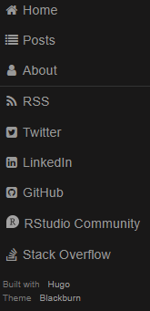
Now if you re render your site, you will see that your RStudio Community tag is included in your sidebar menu! Unfortunately, since the link has a long name, it doesn’t fit perfectly with the default width of the blackburn’s side bar menu. Luckily, all this takes is a little manipulation of the sites CSS, more specifically, the themes/blackburn/static/css/side-menu.css file. I am not going to copy and paste the whole file here, but I will include all of the blocks (and their line numbers) that I modified. If you are customizing for a different theme or social link, I would recommend using the developer tools in your browser to interactively play with different CSS inputs.
Here are the blocks that were changed:
/*
Increase menu size from 150px to 175px
lines 31-38
*/
#layout.active #menu {
    left: 175px;
    width: 175px;
}

#layout.active .menu-link {
    left: 175px;
}


/*
Increase padding between content and side menu and
increase the max width of content
Also increase the padding between the header and side
bar menu
lines 42-56
*/
.content {
    margin: 0 auto;
    padding: 0 2.5em;
    max-width: 1200px;
    margin-bottom: 50px;
    line-height: 1.6em;
}

.header {
     margin: 0;
     color: #333;
     text-align: center;
     padding: 2.5em 2.5em 0;
     border-bottom: 1px solid #eee;
 }


/*
Again, increasing menu width from 150px to 175px
lines 82-93
*/
#menu {
  margin-left: -175px; /* "#menu" width */
  width: 175px;
  position: fixed;
  top: 0;
  left: 0;
  bottom: 0;
  z-index: 1000; /* so the menu or its navicon stays above all content */
  background: #191818;
  overflow-y: auto;
  -webkit-overflow-scrolling: touch;
}

/*
Edit the responsive styles so that when the screen is small or large
menu looks right. In here we alter the menu widths from 150 to 175 and
the left padding from 2 to 2.5 for .header and .content
*/
@media (min-width: 48em) {

    .header,
    .content {
        padding-left: 2.5em;
        padding-right: 2em;
    }

    #layout {
        padding-left: 175px; /* left col width "#menu" */
        left: 0;
    }
    #menu {
        left: 175px;
    }

    .menu-link {
        position: fixed;
        left: 175px;
        display: none;
    }

    #layout.active .menu-link {
        left: 175px;
    }
}

@media (max-width: 48em) {
    /* Only apply this when the window is small. Otherwise, the following
    case results in extra padding on the left:
        * Make the window small.
        * Tap the menu to trigger the active state.
        * Make the window large again.
    */
    #layout.active {
        position: relative;
        left: 175px;
    }
}
Finally, we can add some custom styling for our community icon! This can be placed anywhere in this side-menu.css file and looks like this:
#community-icon {
  padding-left:3px;
  margin-right:0.4em;
}
Our final product looks like this

Conclusion
This post demonstrates how to add an RStudio Community (or any site really) social link to the provided links in the Blackburn theme. While this is specific to the Blackburn theme, a lot of Hugo themes use HTML partials to include things from the config.toml file and this example could likely be extended to other themes after exploring the different files provided in a given themes layout folder.
I hope you consider using RStudio Community for all of your R, RStudio, Shiny, and tidyverse related questions! In addition, adding a link to your blog page will help increase awareness of the site!